Customization
This topic discusses customization of Netspend SDKs.
Majority of the micro app customizations occur at runtime from the parent mobile app.
The Netspend SDK customizations can be categorized into two categories: theme and branding.
Instances of theme and branding are passed while initializing the Netspend WEB SDK. In addition, each micro app provides another level of customization that is documented in specific micro app sections. Go to Netspend Micro Apps and navigate through the micro app options on the left for more details.
Theme
A theme consists of named color palettes. Each color palette defines specific color names like color50 and color100, each with its own color definition.
Following is part of a theme expressed as a JavaScript object. Two palettes shown in the example are neutral and default.
const theme = {
    neutral: {
      color50: '#f7f9f9',
      color100: '#f0f3f3',
      color200: '#e1e7e8',
      color300: '#d9e1e2',
      color400: '#b8bdbf',
      color500: '#97999b',
      color600: '#75787b',
      color700: '#53565a',
      color800: '#37393c',
      color900: '#1c1d1e'
    },
    default: {
      color50: '#d5edf4',
      color100: '#aadbe9',
      color200: '#80c9de',
      color300: '#55b6d2',
      color400: '#2ba4c7',
      color500: '#0092bc',
      color600: '#007596',
      color700: '#005871',
      color800: '#003a4b',
      color900: '#001d26'
    },
    {other palettes}
}
Define a theme to match your brand guide. All UI elements in the Netspend SDK use the theme to provide consistency and a quick way to implement global changes.
Following figure depicts the relationship between theme, palette, and color. Standard ERD connectors show the cardinality between the three items.
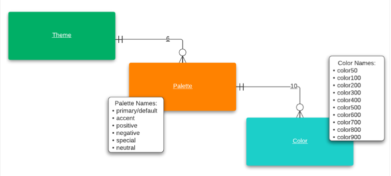
Palettes
Each theme defines neutral, primary (default), accent, negative, and special palettes.
Palettes are described in the following table.
| Palette Name | Description |
|---|---|
| primary, default | The brand’s dominant color. This is the defualt color of the most of UI elements. |
| accent | The brand’s secondary color. This could also be any color that contrasts or best complements the default color, while avoiding interference with the overall harmony of the color system. |
| positive | Enforces positive and creative actions and positive association for our users. These actions may be related to money, movement, addition, progress, continuation, and success. |
| negative | Conveys negative actions, and in some cases, establishes a sense of urgency. Often used on elements that finalize permanent deletion, destruction, subtraction, and input failure. |
| special | Similar to the accent color, the special color contrasts well against the default color. The special palette is reserved for unique states, such as exclusive offers and introductions to new features. |
| neutral | Serves as a foundation and works well when combined with Netspend’s bright core colors. Unlike the core colors, where we try to stick with the color500, we dig deep into our neutral palette often. |
Each palette should provide definitions for the specific color names (example: color50, color100) shown in this sample. The hex values shown are only samples, you should define values that match your branding.
color50: '#f7f9f9',
color100: '#f0f3f3',
color200: '#e1e7e8',
color300: '#d9e1e2',
color400: '#b8bdbf',
color500: '#97999b',
color600: '#75787b',
color700: '#53565a',
color800: '#37393c',
color900: '#1c1d1e'
Web SDK Usage
Define a theme as a JavaScript object, then reference the theme in the SDK initialize function. It is shown in the below sample code.
const theme = {
    neutral: {
      color50: '#f7f9f9',
      color100: '#f0f3f3',
      color200: '#e1e7e8',
      color300: '#d9e1e2',
      color400: '#b8bdbf',
      color500: '#97999b',
      color600: '#75787b',
      color700: '#53565a',
      color800: '#37393c',
      color900: '#1c1d1e'
    },
    default: {
        {color definitions here}
    },
    accent: {
        {color definitions here}
    },
    positive: {
        {color definitions here}
    },
    negative: {
        {color definitions here}
    },
    special: {
        {color definitions here}
    }
  };

await NetspendSDK.microApp.initialize({
  //HTMLElement
  container,
  // The SDK ID for your integration is provided by Netspend and
  // is not a secret value:
  sdkId: 'NS-CERT-ABCDEF',
  // The theme configuration object
  theme,
  // Branding configuration object
  branding: object
});
Android SDK Usage
For simplicity, the same palette is used for each theme.
Define a palette data class. All color names are included. A sample is shown in the below code:
data class NetspendSdkColorPalette(
    val color50: String,
    val color100: String,
    val color200: String,
    val color300: String,
    val color400: String,
    val color500: String,
    val color600: String,
    val color700: String,
    val color800: String,
    val color900: String
) {
}
Define a theme data class.
Note: All themes are included.
data class NetspendSDKTheme(
    val neutralColor: NetspendSdkColorPalette,
    val defaultColor: NetspendSdkColorPalette,
    val accentColor: NetspendSdkColorPalette,
    val positiveColor: NetspendSdkColorPalette,
    val negativeColor: NetspendSdkColorPalette,
    val specialColor: NetspendSdkColorPalette
) {
}
Create a palette class instance.
val palette =  NetspendSdkColorPalette(
    "#eef8fc",
    "#ddf1f8",
    "#ccebf5",
    "#bbe4f1",
    "#aaddee",
    "#99d6ea",
    "#7aabbb",
    "#5c808c",
    "#3d565e",
    "#1f2b2f"
)
Create a theme class instance. The same palette instance is used for each theme.
val theme = NetspendSDKTheme(
    palette,
    palette,
    palette,
    palette,
    palette,
    palette
)
Use the theme in the SDK’s initialization method. See Global Initialization.
iOS SDK Usage
This example defines a palette and themes. For simplicity, the same palette is used for each theme.
Define a palette struct. All color names are included.
public struct NetspendSdkColorPalette {
  public let color50: String
  public let color100: String
  public let color200: String
  public let color300: String
  public let color400: String
  public let color500: String
  public let color600: String
  public let color700: String
  public let color800: String
  public let color900: String
}
Define a theme struct. All themes are included.
public struct NetspendSdkTheme {
  public let primaryColor: NetspendSdkColorPalette
  public let accentColor: NetspendSdkColorPalette
  public let positiveColor: NetspendSdkColorPalette
  public let negativeColor: NetspendSdkColorPalette
  public let specialColor: NetspendSdkColorPalette
  public let neutralColor: NetspendSdkColorPalette
}
Create a palette instance.
let palette = NetspendSdkColorPalette(
color50: "#1f2b2f",
color100: "#eef8fc",
color200: "#ddf1f8",
color300: "#ccebf5",
color400: "#bbe4f1",
color500: "#aaddee",
color600: "#99d6ea",
color700: "#7aabbb",
color800: "#5c808c",
color900: "#3d565e"
)
Create a theme instance.
let theme = NetspendSdkTheme(
  primaryColor: palette,
  accentColor: palette,
  positiveColor: palette,
  negativeColor: palette,
  specialColor: palette,
  neutralColor: palette
)
Use the theme in the SDK’s initialization method.
Branding
Branding is available at the application level as well as the micro-app level.
| Level | Description |
|---|---|
| Application | Allows you to specify your application logo and product name. |
| Micro app | Allows you to specify additional branding specific to the micro app. Example: the Savings Statement micro app allows you to specify the statements list background color. |
Branding attributes are specified in a language-specific structure that is named with the letters mfe (micro front end) followed by the micro app purpose name. In the web SDK, the Savings Statement micro app branding container is named mfeStatements like this:
'mfeStatements': {
  'yearsListBackgroundColor': '#FF3333',
  'yearsBorderBottomColor': '#FF3333',
  'monthsBorderBottomColor': '#FFFFFF',
  'tablesLineColor': '#FFFFFF'
}
The following usage sections illustrate branding for a fictitious example that uses the Link Bank micro app.
Web SDK Usage
Below is a code sample for branding in Web SDK.
const branding = {
    // application level branding
    logo: 'ABC',
    productName: 'Example App'
    // micro app level branding
    ‘mfeLinkBank’: {
       ‘warningImage:’ “exampleWarningImageUrl”
    }
}
await NetspendSDK.microApp.initialize({
    //HTMLElement
    container,
    // The SDK ID for your integration given from Netspend.
    // This is not a secret value.
    sdkId: 'NS-CERT-ABCDEF',
    // The theme configuration object
    theme: object,
    // Branding configuration object
    branding
});
Android SDK Usage
Below is a code sample for branding in Adnroid SDK.
val branding = mapOf<String, Any>(
    	// application level branding
        "logo" to "ABC",
        "productName" to "Example App",
    	// micro app level branding
        "mfeLinkBank" to mapOf<String, Any>(
        "warningImage" to "warningImageDataUrl"
    )
 )
Note: Use the branding map in the SDK’s initialization method. See Global Initialization.
iOS SDK Usage
Below is a code sample for branding in iOS SDK.
let branding: Dictionary<String, Any> = [
  // application level branding
  "logo": "ABC",
  "productName": "Example App",
  // micro app level branding
  "mfeLinkBank": [
    "warningImage": "warningImageUrl"
  ]
]
Note: Use the branding map in the SDK’s initialization method. See Global Initialization.
Loading Screen
You can customize the loading screen (view) that is displayed whenever an entire page needs to indicate that it is loading.
- In the Web SDK, you can only change the spinner color of the default loading screen.
- In the Android and iOS SDKs, you can add a custom loading screen.
The custom loading screen is automatically shown and hidden as needed.
Web SDK Usage
The spinner color uses the value of the color500 setting that you define in your palettes. See Theme for additional information.
Android SDK Usage
By default, a full-screen view with the default ProgressBar indeterminate spinner is used, however, you can set up a new view to use as a loading view.
Override the fun getLoadingView(): ViewGroup method on your NetspendSdkActivity. Also add layout parameters to match the height and width of the main view. The sample code below illustrates it.
class MyNetspendActivity : NetspendSdkActivity() {
 override fun getLoadingView(): ViewGroup {
    val loadingView = FrameLayout(this)
    val spinner = ProgressBar(this)

    val centerLayout = FrameLayout.LayoutParams(
      FrameLayout.LayoutParams.WRAP_CONTENT,
      FrameLayout.LayoutParams.WRAP_CONTENT
    ).apply {
      gravity = Gravity.CENTER
    }

    loadingView.addView(spinner, centerLayout)

    return loadingView;
  }
}
iOS SDK Usage
By default, a full-screen view with the built-in UIActivityIndicatorView is used, however, you can set up a new view to use as a loading view.
Change the animation by setting a UIView on the NetspendSdkViewController and add constraints to take over the entire view’s margins.
The following code sample defines a createLoadingView function that creates, customizes, and returns a UIView. The outer code uses the function to define the controller’s loading view.
let netspendViewController = NetspendSdk.shared.openWithPurpose(
   ...
)

netspendViewController.loadingView = createLoadingView()
// present netspendViewController

func createLoadingView() -> UIView {
  let loadingView = UIView()
  loadingView.backgroundColor = UIColor(white: 0, alpha: 0)
  loadingView.isOpaque = false

  let spinner = UIActivityIndicatorView(style: .whiteLarge)
  spinner.color = UIColor.gray
  spinner.startAnimating()
  spinner.translatesAutoresizingMaskIntoConstraints = false

  loadingView.addSubview(spinner)
  loadingView.addConstraints([
      spinner.centerXAnchor.constraint(equalTo:
        loadingView.safeAreaLayoutGuide.centerXAnchor),
      spinner.centerYAnchor.constraint(equalTo:
        loadingView.safeAreaLayoutGuide.centerYAnchor)
  ])

  return loadingView
}
Updated over 1 year ago